writing2026-10-15
How I built this site
4 min readNext.js, Process, Design
The stack, the workflow, the performance and the phone layout of this portfolio, from a failed first attempt to 133 reviewed pull requests.
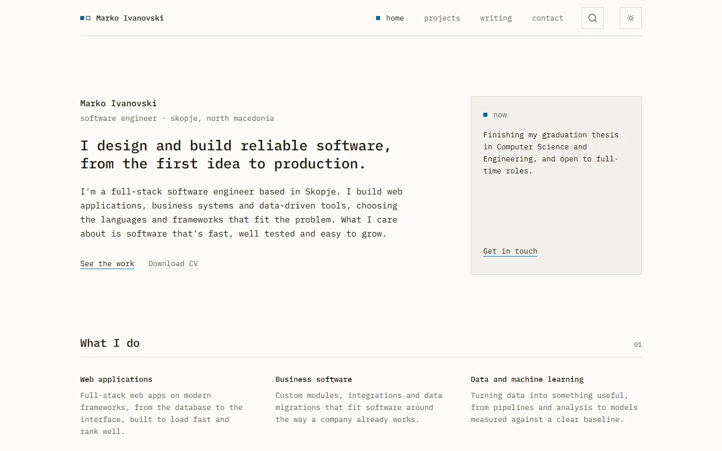
This is the second version of this site. The first one failed, and not because of the code. I wrote it faster than I could review it, so by the time something looked wrong I could no longer tell which change had caused it. I archived it and started again on 25 August 2026, with one rule: nothing gets built that hasn't been planned and can't be reviewed.
Seven weeks and 133 merged pull requests later, here is how it came together.
The rule that shaped everything
Every change starts as a story on a Jira board. A story gets one branch and one pull request, and its acceptance criteria are the checklist the pull request is reviewed against. If a criterion can't be met, the pull request says so instead of merging around it.
The specifications live in Confluence: the architecture, the design system, the content model, the SEO and performance standards and the definition of done. Next to them sits a Decision Log, with more than forty decisions so far. Each one says what was decided, why, and what it cost. When I wonder months from now why the site has no analytics, the answer is written down.
The repository runs full GitFlow, even though I'm the only one working on it. Features branch off dev, releases go into main, and every commit on main is a tagged release. It's more ceremony than a solo project needs, but the history is part of what the site shows, so I wanted it to read well.
The stack
- Next.js 16 with the App Router and strict TypeScript.
- Tailwind CSS 4 and a handful of shadcn components, restyled by hand to fit the design.
- Neon Postgres with Drizzle for projects and skills.
- Velite with Zod for blog posts and the experience timeline, which are files in the repository.
- Vercel for hosting.
The most important choice is that the site is fully static. Neon's free tier takes 300 to 500 milliseconds to wake up, which is too long to make a visitor wait. So Postgres is read while the site builds, and every page ships as HTML. A new project reaches the site through a seed script, a pull request and a deploy.
Some things were rejected on purpose. There's no CMS, because it would cost money and memory that a site this size doesn't need. There are no analytics of any kind, not even privacy-friendly ones, and Lighthouse in CI measures performance instead.
The design, three times
The design changed twice before it settled. The first version had a Three.js scene in the hero. The second, a style I called Technical Atlas, lasted less than a week. Neither was bad, but neither said much about how I work.
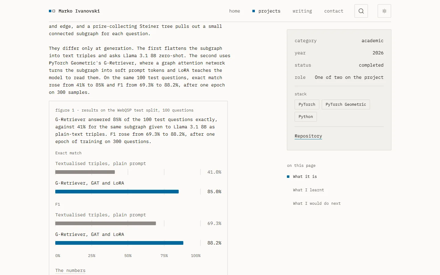
The third is a grid. One monospace face, IBM Plex Mono, sets everything from the name to the footer. There's one accent colour, a 2px radius everywhere, and hairlines where other sites use shadows. Motion is limited to a list of seven, among them the section reveals, the filter drawer, popups, a small lift on hover and the crossfade between pages. All of it switches off when your system asks for reduced motion.
Performance
Every pull request has to pass content validation, type checks, tests, lint, formatting and a production build before it can merge. A bad field in a blog post fails the build, not the live page.
Pull requests into main also run Lighthouse on every route, on an emulated phone with a throttled connection, three times each. The gates are strict: performance of at least 90, at least 95 for accessibility, best practices and SEO, the largest paint within 2 seconds, layout shift under 0.05, and a budget for how much JavaScript each page may load.
This is the median of the run on the 1.0.0 release:
| Page | Performance | Largest paint | JavaScript |
|---|---|---|---|
| Home | 97 | 1.66 s | 260 KB |
| Projects | 96 | 1.61 s | 244 KB |
| Case study | 97 | 1.62 s | 250 KB |
| Writing | 98 | 1.58 s | 222 KB |
| Contact | 97 | 1.61 s | 281 KB |
| Privacy | 98 | 1.58 s | 218 KB |
Layout shift is zero on every page, because each image reserves its space before the file arrives. Accessibility, best practices and SEO score 100 everywhere.
The gates caught real problems, but not everything. A green build proves the types line up, not that the right text reached the page. Several mistakes only showed up when I read the generated HTML.
On a phone
The people this site is for usually open it on a phone, from a link, once. So the phone layout isn't a shrunk desktop. Each piece was rebuilt for a narrow screen and checked at 320 and 390 pixels wide.
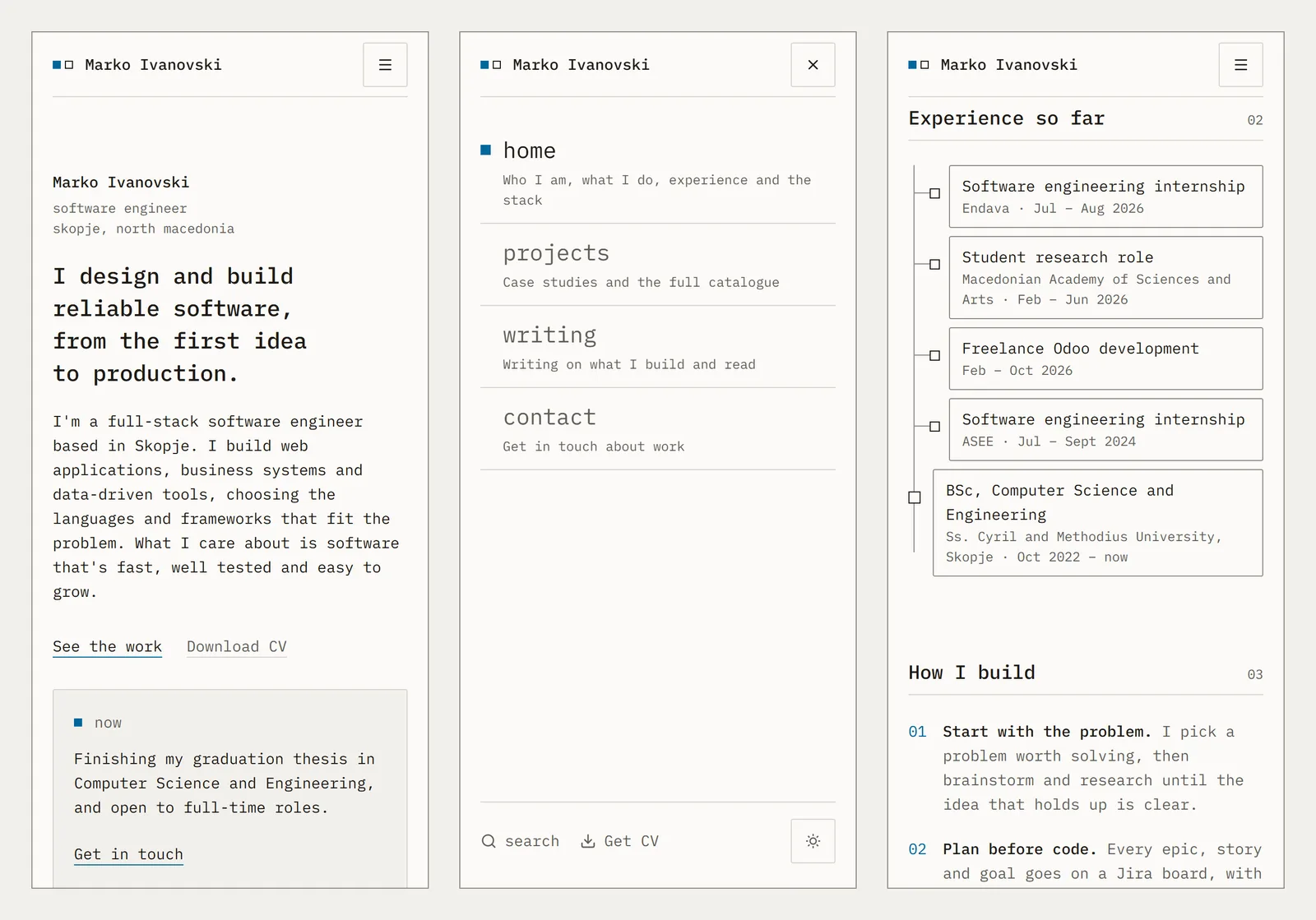
The menu takes the whole screen, with a line under each page saying what it holds. The experience timeline, a horizontal chart of branches on a wide screen, becomes a vertical list below 1024 pixels, because a chart you have to scroll sideways is a chart nobody reads.
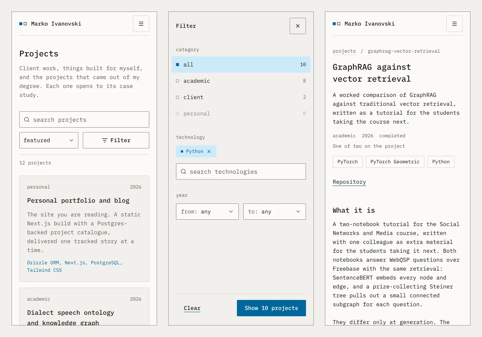
On the projects page, the filter panel slides in from the right and fills the screen, the same motion as on a desktop. The sort control shortens its label on narrow screens so it never wraps. Every tap target is at least 44 by 44 pixels, and nothing on any page scrolls sideways, down to 320 pixels. The one thing that did was the spam check on the contact form, a fixed 300-pixel box. It now switches to its compact size when there's no room.
Still learning
This site is a snapshot of what I know today, not a finished product. I'm still learning, and there's plenty I would do better: things I'd structure differently, pages that could be faster, writing that could be clearer. Some of it I can already see, and more will show up as I learn.
Rather than chase all of it at once, I'll take the improvements one at a time, the same way the site was built: a ticket, a branch and a reviewed pull request each.
Where it stands
Version 1.0.0 is the site you're reading: the home page, twelve projects with written case studies, this blog, a contact form and a privacy page that says the site collects nothing. The next posts will go deeper into individual projects and the problems they turned up.
If you have a question about any of it, get in touch.